Tuesday, October 25, 2011

Blog 11 2bMe.org Website

Social Circles Page


This is one of the interior pages for the website www.2bme.org.  It is a website for teens which is based on a public service program for thirteen- to seventeen-year-olds deal with appearance-related issues dealing with cancer treatment.  The website itself is easy to navigate.  The top bar has clickable pictures that bring you back to the home page.  The bottom bar brings you to other links of interest and the interior links take you more in depth into the topic.   The vibrant colors, characters, and typeface will appeal to teens.  The content is thoughtful yet not too heavy considering the difficulty of the situation.  It seems like the designers had to walk a fine line between being too upbeat and serious.  This seems like perfect compromise and a way to help teens through a especially challenging time.

 
Source:  2bme.org, Communication Arts, Interactive Annual 9, September/October 2002.

Saturday, October 22, 2011

Blog 10 Roberto de Vicq de Cumptich

Men of Letters & People of Substance


This is the two facing pages from the book by designer/illustrator Roberto de Vicq de Cumptich entitled Men of Letters & People of Substance.  The entire book consists of text images of important historical and literary figures.  I found this article fascinating and the art that de Cumptich makes with text and a bit of color unbelievable!  The images that de Cumtich created of Truman Capote and James Joyce really capture the facial features of the men themselves.  Of course, I've only seen pictures of them.  But the moody, dark, melancholy of Truman Capote can be seen in the text image as easily as a photograph.  The same can be said for the proud, learned, yet troubled, James Joyce.


Source:  CMYK Volume 47, Interview with Designer/Illustrator Roberto de Vicq de Cumptich, pp. 80-83

Friday, October 14, 2011

Blog 9 PENTEGRAM STUDIOS


20/20 Foresight

This poster was created by Michael Gericke of Pentegram to advertize an architectural symposium entitled, 20/20 Foresight: Looking Ahead at Architecture which was held December 4, 2002.  The focal point type 2002 is used in a very clever and humorous way.  It represents glasses, thus, the theme of the lecture 20/20 Foresight and also the year 2002. The focal point, 2002, is so bold and interesting that it grabs interest of the audience: they must read the text at the top and bottom to find out the purpose of the poster.  The poster has a primary color theme on black which really makes the colors pop and the white "pupils" seem to emerge from the page.  Unity is created by color and typeface and is balanced symmetrically. Using typography for something more than just what it says - 2002 - increases its communicative power dramatically: producing a picture with type creates new significance.  The designer creates a captivating image that communicates the theme of the lecture in a clear, direct, and entertaining way.


Source:  Samara, Timothy, Typography Workbook, A Real-World Guide to Using Type in Graphic Design, Rockport Publishers, Inc., 2004

Wednesday, October 5, 2011

Blog 8 Joost Schmidt

Bauhaus Exhibition Poster 1923

The Bauhaus School was born from the angst of World War I and ugliness of the industrialized society that had brought Europe to that point.  Its goal was to recognize and unify the commonality of the fine arts and the applied arts.  The Bauhaus School worked to elevate standards of design and public taste through excellence in design and craftsmanship. [Whitford]

This particular piece was designed by Joost Schmidt for the Bauhaus Exhibition of 1923.  This piece reflects on of the many "shifts" if the teaching philosophy at the Bauhaus School from "Art meets Craft" to "Art meets Machine."  This was a natural, if not controversial within the school, step for the Bauhaus during the industrialization on the early 1900's. [Whitford]

This early modern work uses geometric shapes and machine forms to showcase the innovative work done at the Bauhaus.  One can see influence of other types of art from the period in the piece, cubism, constructivism, Di Stijl which also reflect the principles of the school - to take diverse styles and meld them into new design approaches.  

The high contrast color scheme creates drama and intensity in poster, although I am not sure that it comes across in the scan.  The repetition of circles, textures (solids, pavement-like surface, lines, and mesh), color, and typeface all create unity in this work.   

The typefaces is square-shaped with no curves except for the Ausstellung and 1923. The text is placed perfectly to guide the eye through the work.  The face is the "seal" of Bauhaus and signifies how man meets machine.  I like the tilting of the axis of the poster; it, creates a sense of imbalance - the teetering of the machine.  Or is this just a part of a much larger work - a larger machine?  And is humanity just part of a larger machine?  Waxing philosophical, here!?!

Personally, the object in this poster remind me of a toy my daughter had as a baby.  It was called a "Weeble" and it's ad-line was "Weebles wobble but they don't fall down."  It had a rounded, weighted solid bottom and she would bat at it and it would bounce right back.  It wasn't quite as artfully designed as the poster, though.  I think it had a pink plastic puppy on the top. I wonder how the Bauhaus artists would feel about the Weebles...

Source:  Whitford, Frank, Bauhaus, The World of Art Series, Thames and Hudson Ltd., London.

Monday, October 3, 2011

Blog 7 (EXTRA) - Radiohead

Radiohead - 
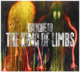
The King of Limbs

Radiohead recently did a full hour special on The Cobert Report.  My husband and I are long time fans of the band and get all of our fake news from The John Stewert Show and The Cobert Report.  The real stuff brings me to tears...  Anyway, I enjoyed listening to their music but especially loved hearing about their personal views on environmental issues and corporate sponsorship.  I think there are speaking out try to help us understand the evils of unchecked capitalism and the damage we are doing to our earth.  Maybe some listeners with heed the message.

I was very attracted to this CD jacket.  It is eerie and it has an other-worldly feel.  I looked up the designer on the internet to see his motivation of the artwork. [wikipedia]  Here is what I found:

Artist Stanley Donwood stated that the album's artwork is inspired by Northern European fairy tales and their association with forests and woods: "It's very much about natural forms. I'd heard something about the northern European imagination, in the all our fairy stories and mythical creatures, they all come from the woods - Little Red Riding Hood, Sleeping Beauty, Hansel & Gretel [...]  Me and Thom Yorke [sic] were working on these ideas of strange, multi-limbed creatures that are neither malevolent or benevolent, they're simply there, part of the living spirit of the forest. That's come through into all of the work.

This piece reminds me of the monsters that used to live under my bed as a child: nondescript, blob-like, big-eyed, with long slimy limbs.  It does appear that these creatures are appearing from the woods; you can see the trees plastered (as a part of) their bodies.

The colors used are captivating: the limbs are a sickening, slimy red, the eyes glow yellow, the darker blues,  greens, & black which create depth. The brightness of the yellow creature pulls you into the piece and you have to look closer.  

The text treatment is also very interesting,  The white lettering is obscured but the overlay of branches - a play on the title The King of Limbs.  The type is a simple san-serif font.  Well-chosen, I believe, anything too busy would distract from the image.

I believe this is a highly effective work and it is done beautifully.  It is unified through the texture that runs throughout the piece even into the text.  Gestalt theory definitely plays a role here in that initially the large creatures pull us into the image and then as we look closer we see all of the texture that contributes to the unity of the piece.  

Source: http://en.wikipedia.org/wiki/The_King_of_Limbs_Packaging_and_artwork

Saturday, October 1, 2011

Blog 6 - Henryk Tomaszewski

Rok Chopinowski 1949

Henryk Tomaszewski is known throughout the world as a giant in the field of Polish posters. [Meggs]  In a forward by Shoji Katagishi, Tomaszewski's work is described as having no exaggerated posturing or hardness; that his free, open form of expression has a feeling of dignity and intellect; and that his drawn lines are refined, strong and lyrical, with ample amounts of space and color. [Meggs]

This poster was designed for an annual International Chopin Competition held in Poland in 1949.  It exemplifies all of elements that Katagishi points out about Tomaszewski's work.  The image of the grand piano is straightforward and open - just the keyboard and the top - in flat, broad shapes and simple lines.  The music stand, which consists of ornate curves, doubles as the title block for the poster.  Even though the lettering is small relative to the size of the poster, it is emphasized because of the complex border and the color.  The color scheme makes use of earth tones with a background of muted olive green in a cloudlike pattern, a flat rust color for the titles, and of course black & white for the piano.

Source: Meggs, Philip, Six Chapters in Design, Chronicle Books, San Francisco, California, 1997